25.11.11

Unthink talk

I went to a talk today from a visual communications group called 'Unthink'. They simply talked about the work they've done and how they went about it. I found it so interesting, They used alot of colour in their work and had a very fresh young outlook on graphic design. Although I'm almost certain viscom is the route for me, they really assured me. This was bacause I could see that they were not motivated by money.Their work was really fun and I could tell they really enjoy their work, Rather than doing work simply for the paycheck.

Have a look at their website, It shows all the work they were showing to us today,
http://www.unthink.ie/

Here were some of the things that interested me for one reason or another;

A piece on Helium for Gav Beattie

The cover of the brochure for the offset conference 2010
An invitation for an exhibition in the Sbastian Ginness gallery.
Boobies!
skateboard/icepops made for the 'Hit the Decks' art show, part of Kings of concrete 2010.

In thinking the craic does be had in the Unthink studios!!

Amy x

FFFASHIOn

This vieo by fashion photographer Ruth Hogben reminds me of my experiments of the movement of ink through water. It captures the sublimity very well. Like!!

Printin'

Sooo, This week I did about 25 prints,I started with 2 lino blocks and experimented with colour and with how I layered them. After that seemed pretty successful I carved 5 different lino blocks in the same style so that none of the next seventeen or eighteen prints were the same. I then printed a series of about 18 blue and green coloured prints ( I know I was told I was doing too much blue, but come on!! the sea is blue!!). I plan on putting these prints in a series or kindof tiling them maybe

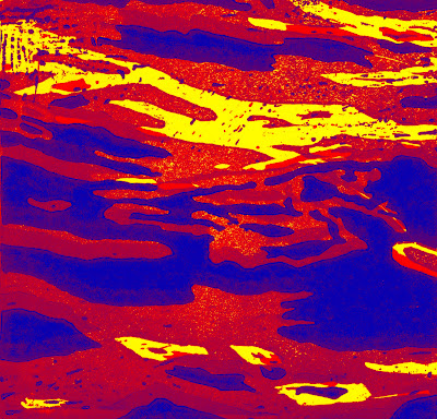
Here are a series of one of the initial prints I did, I scanned it into the computer and played around with them on photoshop to make these image. I really like the result. They look kindof psychadelic but when they were printed out they look amazing. The colours were really strong and vivid. It also got me away from using blue, which I guess is a good thing...


This rippling water reminds me of weather maps and isobars

 this got me thinking of how we look out the window to see the weather and dont hare to always rely on a weatherforcast or weathermap for the weather.
So I made this window piece to portray my thoughts.


----------------------------------------------------------------------------------------------------

This piece was inspired by the ripple effect when water is disturbed


18.11.11

Round and Round and Round and....

Here I'm looking at the circular movement of waves


SHAKE IT UP!!


Sooo.. Group crit today with Patricia.

We were asked to visit each studio space in pairs and write down about 5 negative things about the person's work.
At first I was thinkig 'what ever happened to positive thinking??', But I turned out that we all got alot of constructive criticisim that we could build on!
I was left with a damn long list, which I'm surprisingly happy with. I was sick of being told 'Thats really cool' or 'I like that'.

This gives me something to work on.

  • Confusing contextual notebook
  • Need more 3D work
  • BIGGER work
  • Elaborate on contextual resarch
  • Branch out my ideas
  • Use a variety of colour
  • Experiment!!
  • Look at different aspects of the wave
  • TOO MUCH BLUE!
  • Too literal
  • Too repetative
  • Unnecessarily filling space
  • Work is too 'Heavy'
  • Change materials
MUCH TO DO!!
-Amy x